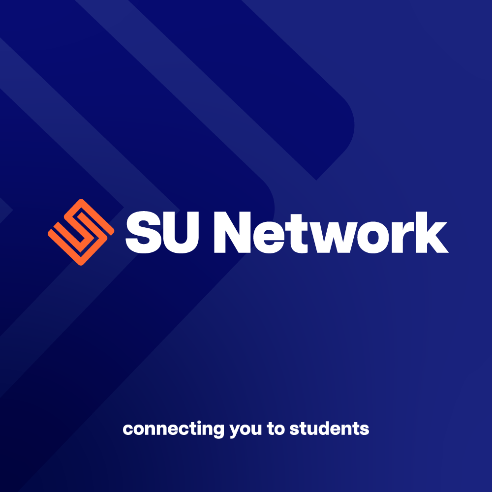
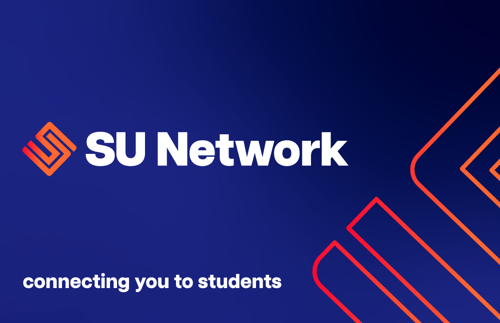
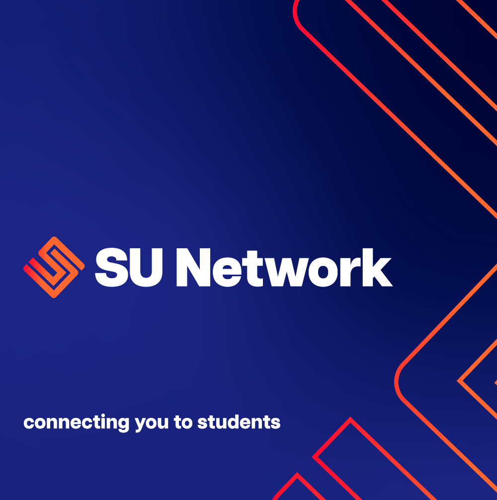
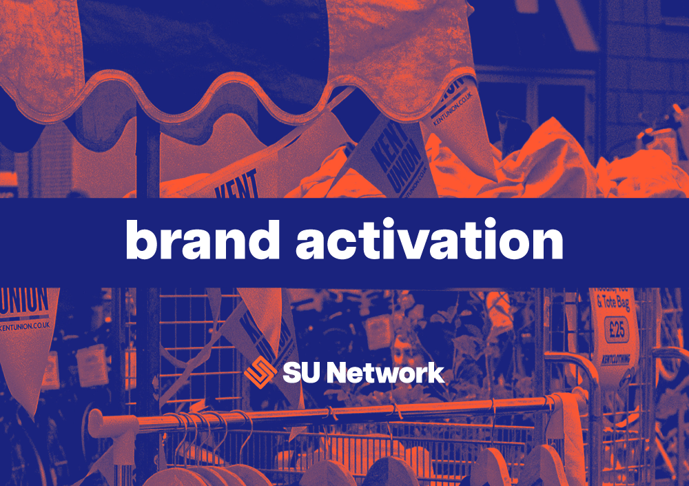
SU Network connects brands with students on university campuses across the country.
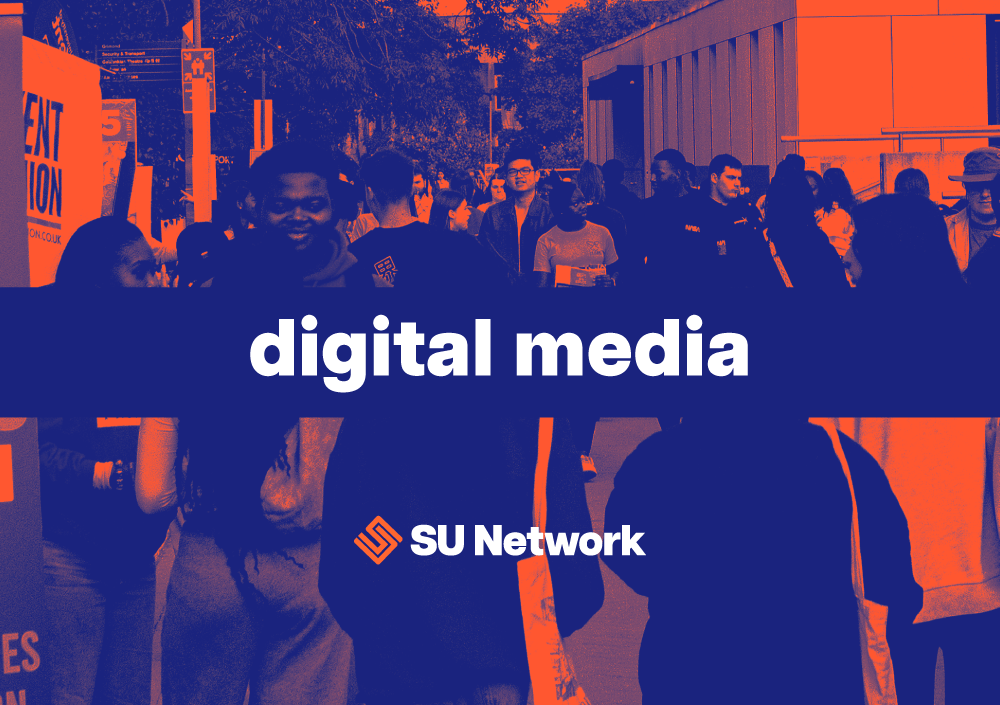
The team wanted a refreshed look that visually communicated their values of connection, customer service and enhancing the student experience. The new logo creates a play on ‘SU’ using interlocking lines representing the connectedness between brands and students and the perfect partner fit created by the SU Network team. The classic navy blue and white colour scheme is a timeless look that is often used in the higher education sector, which when paired with the pops of warm orange and abstract gradients create a brand that is both fun and contemporary.